Design Process
You can learn more about the methodology behind my design process below.
Understand

Persona
To ensure we understood our user’s story, we created a persona for our user, Nicole.
Ideation: Failure and Learnings
Our initial ideation sessions involved live sign-language translation between deaf persons and hearing persons. This failed.
We learned this was impossible with our current technology, but most importantly, we failed to realize the disadvantages the deaf community has always had navigating a hearing world.
Upon realizing this in our research, we shifted directions and I created this How Might We statement to help us brainstorm the features that our solution would include:
“How might we assist deaf people to navigate the hearing world by becoming aware of surroundings that rely on auditory senses?”
Considering that our interviewee cited everyday sounds as a pain-point in their life, it made sense for us to create these artifacts to get in the mindset of our user:
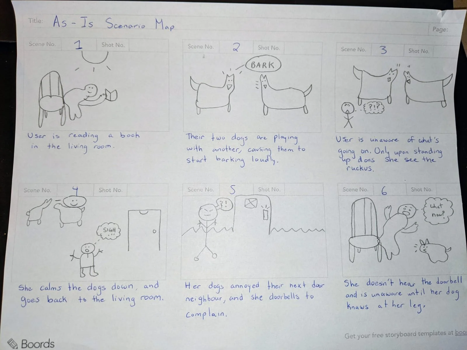
Storyboarding
An interesting scenario our interviewee gave was not being able to hear her dogs barking. We mapped this out in a storyboard to better understand the situation and find moments of opportunity.
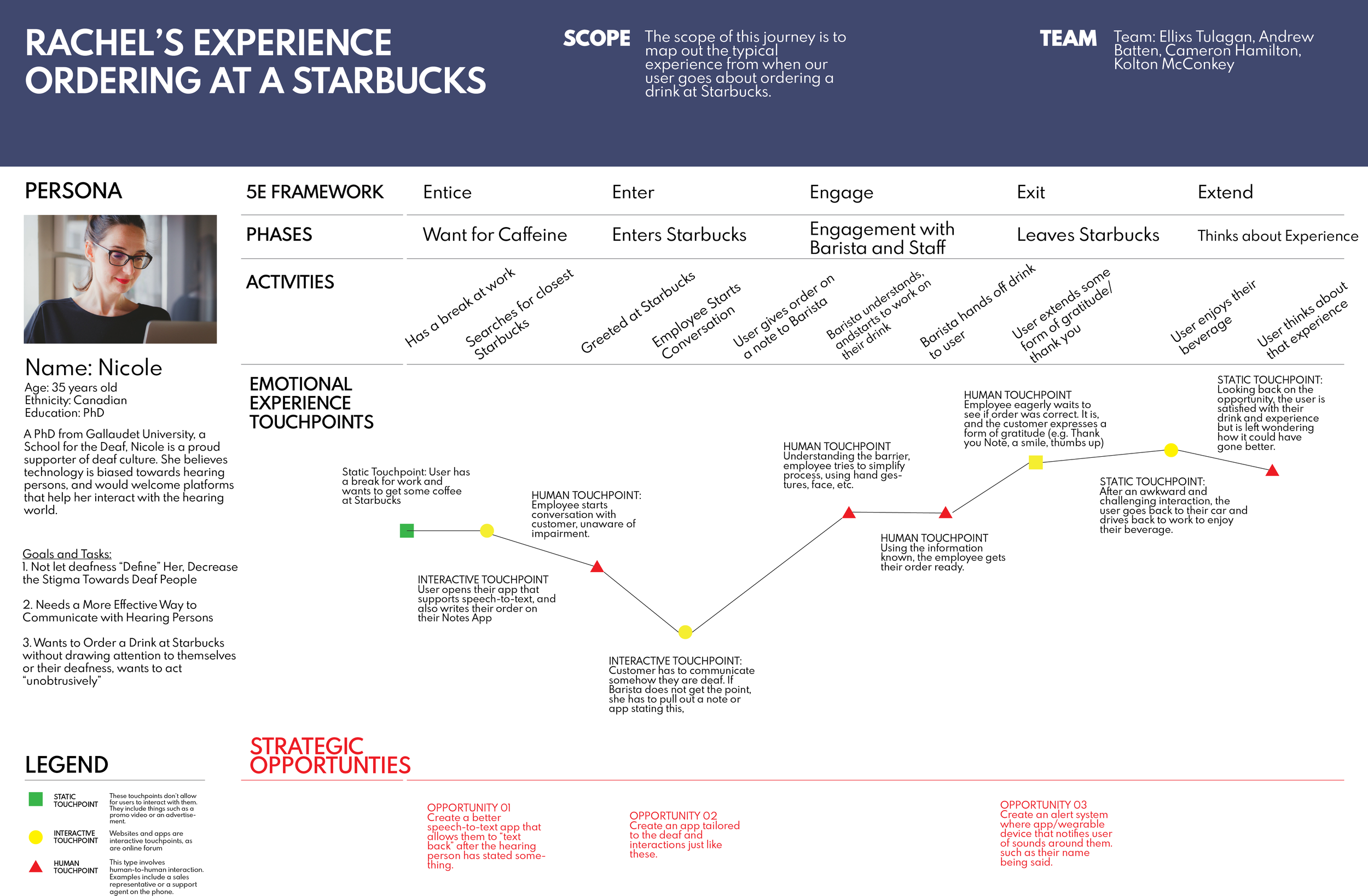
User Journey Map
Our interviewee brought up the pain-points and awkwardness she encounters when ordering at Starbucks, and so I created this journey map out of it to highlight moments of opportunity and specific obstacles we can help solve.
Prototyping
Sketches

Initial product sketches by our industrial designer, Kolton
Rough UI sketches by Ellixs (myself)
Task Flow
Having gotten a vision of what we want the app to look like, I created this task flow to map out the steps our user goes through when adding a new sound to the app.
The goal for designing this task was to make it as simple and straightforward as possible.
Wireframes/Low Fidelity Prototyping
Further product development of the smart necklace by Kolton
Medium Fidelity Prototyping
After we made our initial wireframes, Andrew designed the first iteration of our prototype with an initial color scheme.
User feedback was that they understood the dark theme, but it felt too apocalyptic. We needed to make a change…
Final Form Factor
Kolton finalized the form factor for the smart necklace with this as the final design. The LED screen displays the type of sound that was detected, whether by the app or by the necklace. It’s color-coded and uses icons to easily let the user know what sound it was.
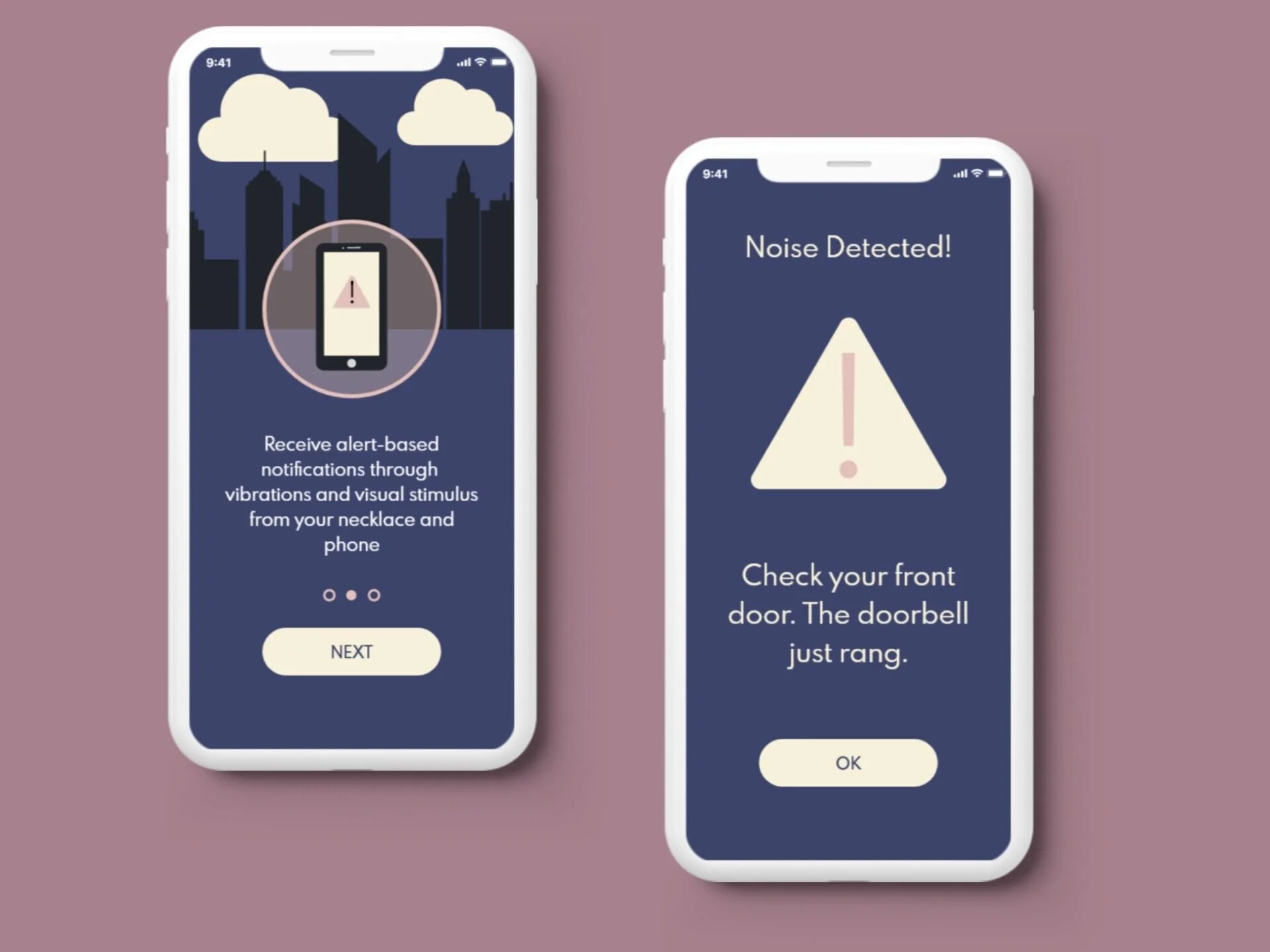
High Fidelity Prototyping
I connected with Andrew to come up with a new color palette for the app. I wanted Cognizant to evoke feelings of calm and reassurance and settled on navy blue, soft pink, and light cream as the color palette.
These colors not only have metaphorical meaning but also serve each other very well visually.