
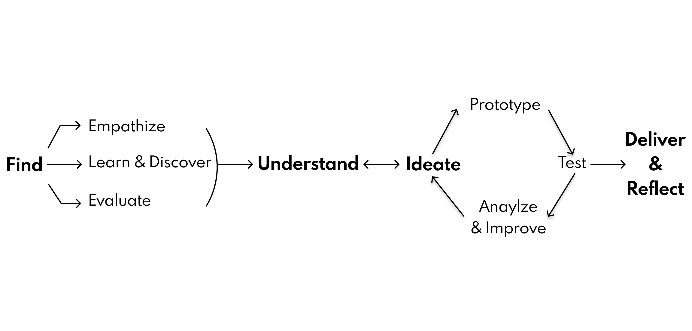
Design Process
You can read more about the methodology behind my design process below.
Persona One: Meet Charlotte, Our Primary User
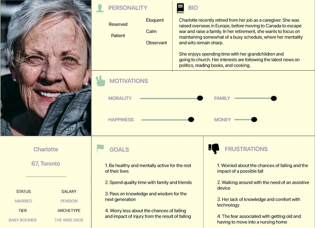
Based on our primary and secondary research, we sought to narrow down on who our user is and created a persona to incorporate the needs, goals, and observed behavior patterns of our target audience.
Charlotte is 67 years old and retired. She enjoys spending time with her grandchildren, going to church, and cooking - among other things.
Other anxieties include: not being able to visit with her grandchildren, go to church, or being able to use her kitchen
As Charlotte approaches her 70s, she is becoming more and more worried about her risk of falling and the impact that a fall would have on her physical and mental abilities
Meet Laura, Our Secondary User

In our research, it became clear that the elderly would not be the only user of our app/wearable. Not all seniors are comfortable with technology as much as the younger generation is. Medical professionals and long-term care workers who assist in the aide of the elderly and are savvier with tech can utilize this technology within their workspace to better understand the health conditions of those they care for and ease the learning curve for seniors.
Therefore, we introduced Laura:
She is a medical student who cares for her grandfather who suffered a nasty fall many years ago.
While she wishes to advance in her career, she has sympathy and a deep love for her family member and may not be able to dedicate as much of her time and resources to him as much as she would like to.
Ideation Techniques: Big Idea Vignette

We ideated possible solutions with our goal in mind: reduce people’s anxiety around falling, increase their capacity to make informed decisions for fall prevention, and maintain the independence of the elderly. We found our ideas could be assigned to 4 main features/themes:
1. Wearable sensors
2. Wellness applications
3. Walking aids
4.Environment hazards
Ideation Technique: Prioritization Grid

Less is more. Overwhelming our users with a multitude of features would lead to a poor user experience, therefore it made sense to maximize value and feasability by organizing features into a prioritization grid.
Being able to detect walking patterns and having it as a wearable attachment made the most sense given our objective is centred around preventing falls. Anxiety-reduction strategies, exercise program and a prescription tracker adds value to create a holistic approach to preventing falls.
Wireframing
I designed some medium-fidelity wireframes to see what the app would look like in principle, exploring the features stated above, along with some tentative color palettes.
User Testing
Methodology: Three 1:1 Usability Sessions. We conducted these sessions to gain an understanding of user feedback and identify their struggles and satisfactions.
Top Struggles:
Font, Button, and Image size were too small, and users had a difficult time reading or figuring out what to do.
Solution: Size revision and increase pixel size of font, button and images
Result: Faster task completion
Some of the language used was too jargon-y and confusing to users.
Solution: Changed language based on phrases or words users found confusing
Result: Less confusion and more understanding gained of the interface
Users had to read each page carefully, admitting that their age and/or inexperience with apps were playing a part.
Solution: Reduce text and add images, try to make each piece of content fit the appropriate context
Result: Less time spent trying to interpret what a task does or what it was asking
Top Satisfactions:
There is no need to scroll down to see all the information they need to know.
Effective walk-through of features and feedback is given when they complete a task.
No need to recall information.
With these findings in mind, we integrated these changes into our prototype.